 marygans
Industry Solutions Catalog Redesign
redefining the Microsoft seller's catalog web experience
What was delivered?
✔️ Ideation + Brainstorming
✔️ Persona creation
✔️ Branding exploration
✔️ Information Architecture
✔️ Card UI design
✔️ Landing and Search UX design
Now, let’s start with the problem.
There is a lack of a central place as a “source of truth” where sellers can efficiently find re-useable IP assets (delivery oriented or pre-sales oriented) resources that are complete and of high quality.
In addition to this:
- Sellers are currently insufficiently deconstructing and sifting through previously sold deals.
- Deficiency in personalization
- The absence of an existing scalable design system.
Impact as a result of the problem
Microsoft Sellers often experience a fragmented and disconnected sales ecosystem, leading to inefficient, confusing, and disjointed customer engagements.
How can we fix this?
A central repository providing enterprise sellers with a comprehensive view of Microsoft’s professional services offerings to reusable customer-centric sales teams.
The redesigned web experience will empower Sellers to achieve business targets faster through a simplified, intelligent, trusted experience.
- Establishing a scalable design system.
- Accelerated time to close a deal. Assist users to quickly and easily find relevant offers based on a customer needs.
- Proactively surface more relevant, personalized content to sellers.
- Facilitates the easy identification of trending assets within the seller catalog.
Humanizing the problem
This involved creating detailed and relatable representations of our target audience, the Microsoft Seller. Going beyond demographics and statistics to understand their motivations, behaviors, needs, and emotions.
This process helped myself and our team develop a deeper understanding of our customer, the seller, enabling more effectively personalized strategies.
Personas
Overview of all sellers
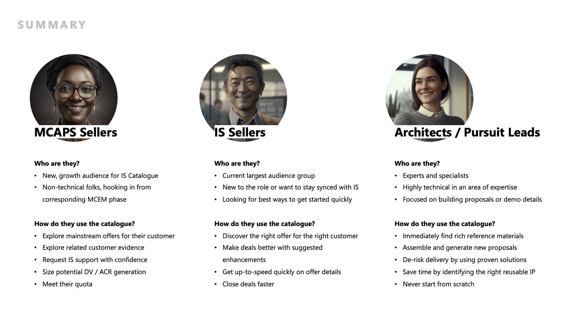
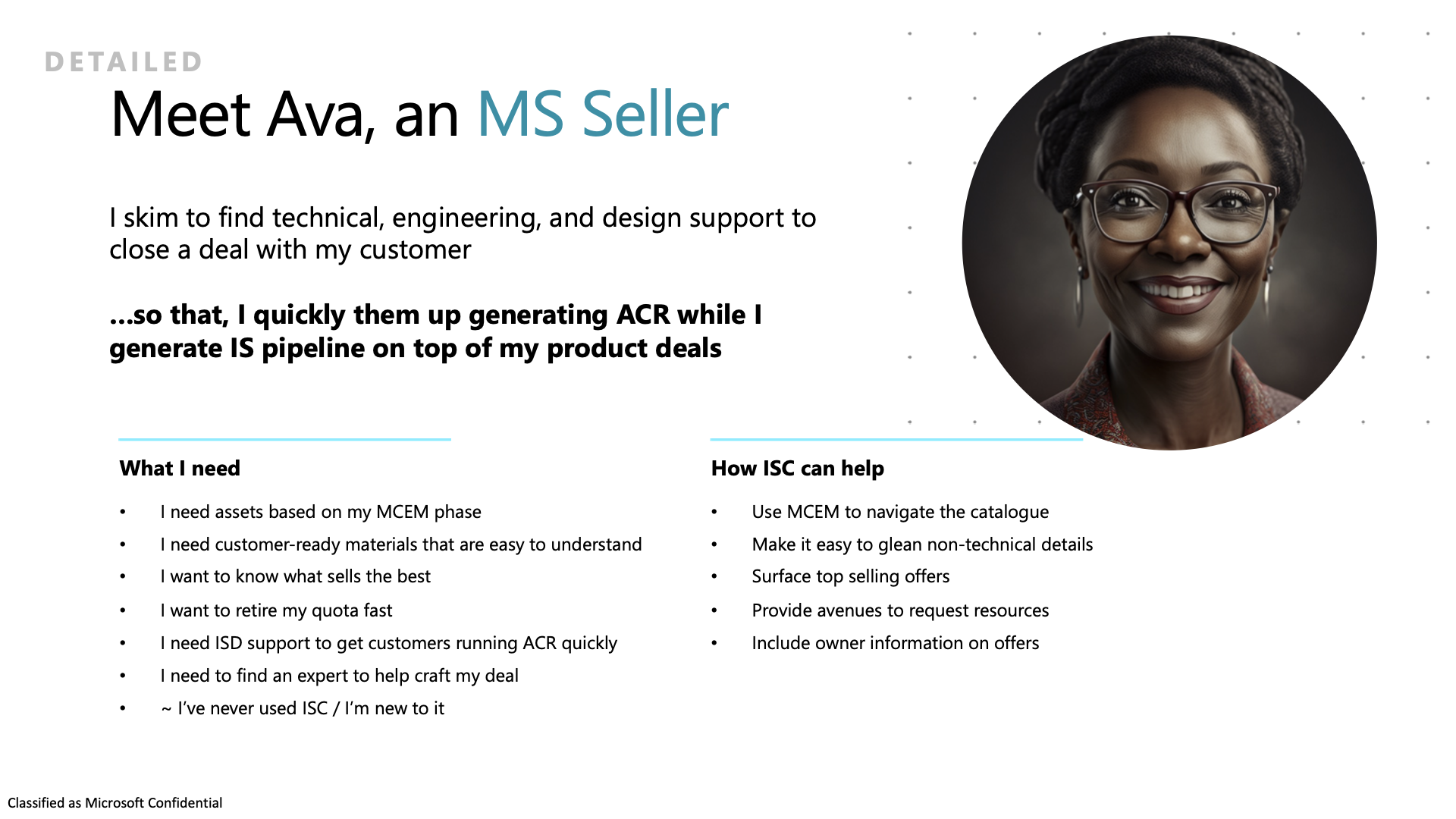
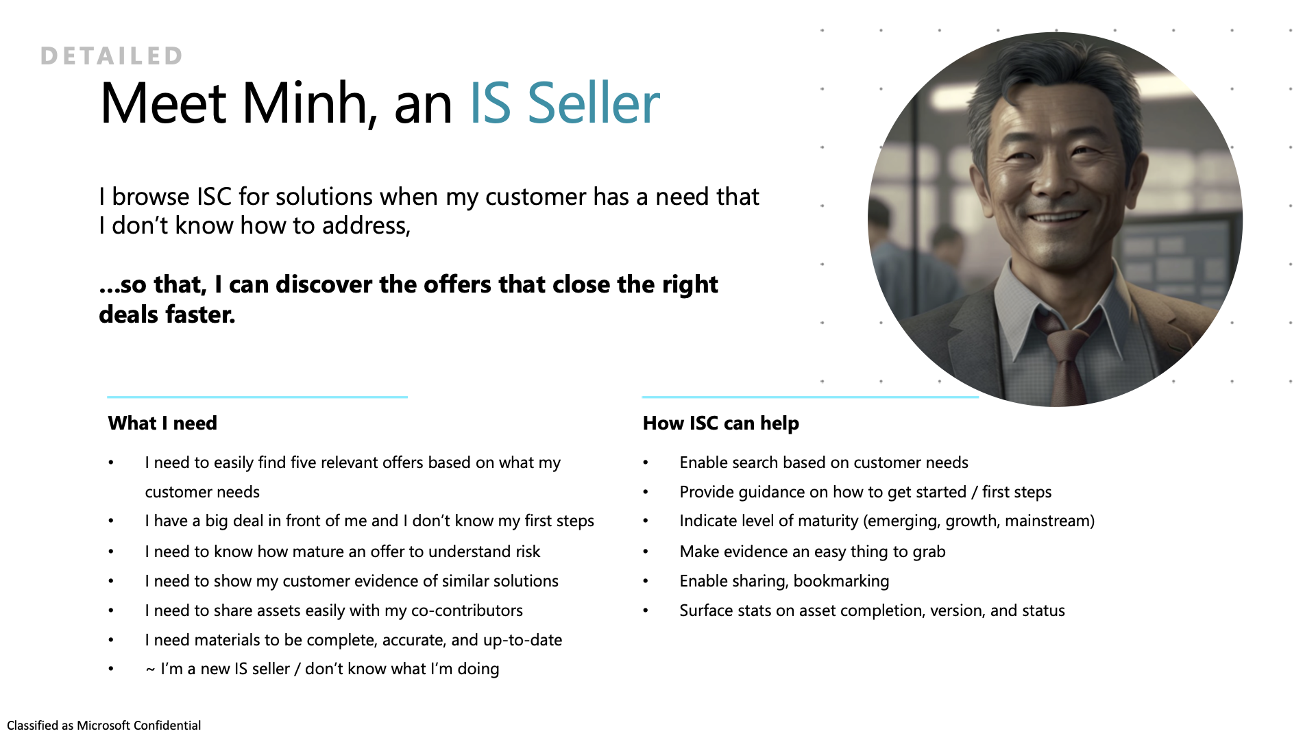
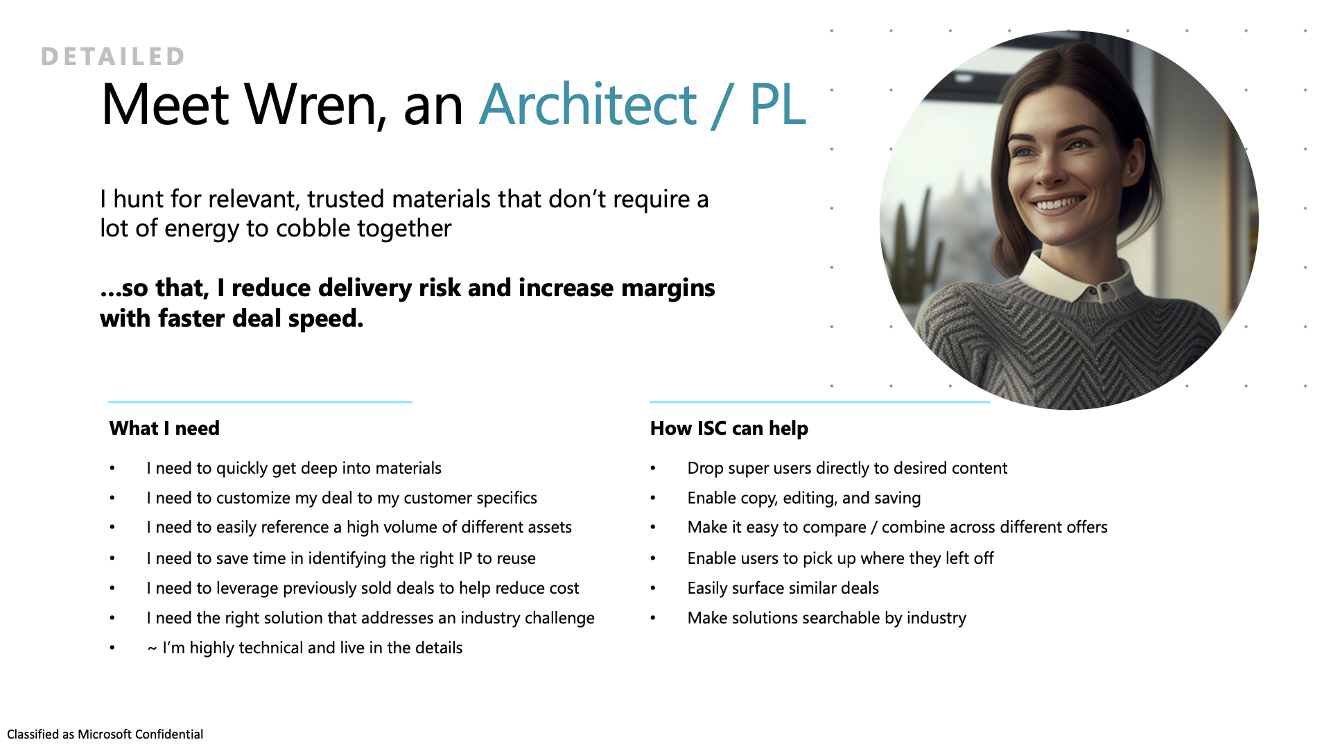
Each persona represented has a unique problem to solve in relation to their experience with the Catalog.
MCAPS Seller
Industry Solutions Seller
Technical Seller
Mood Boarding
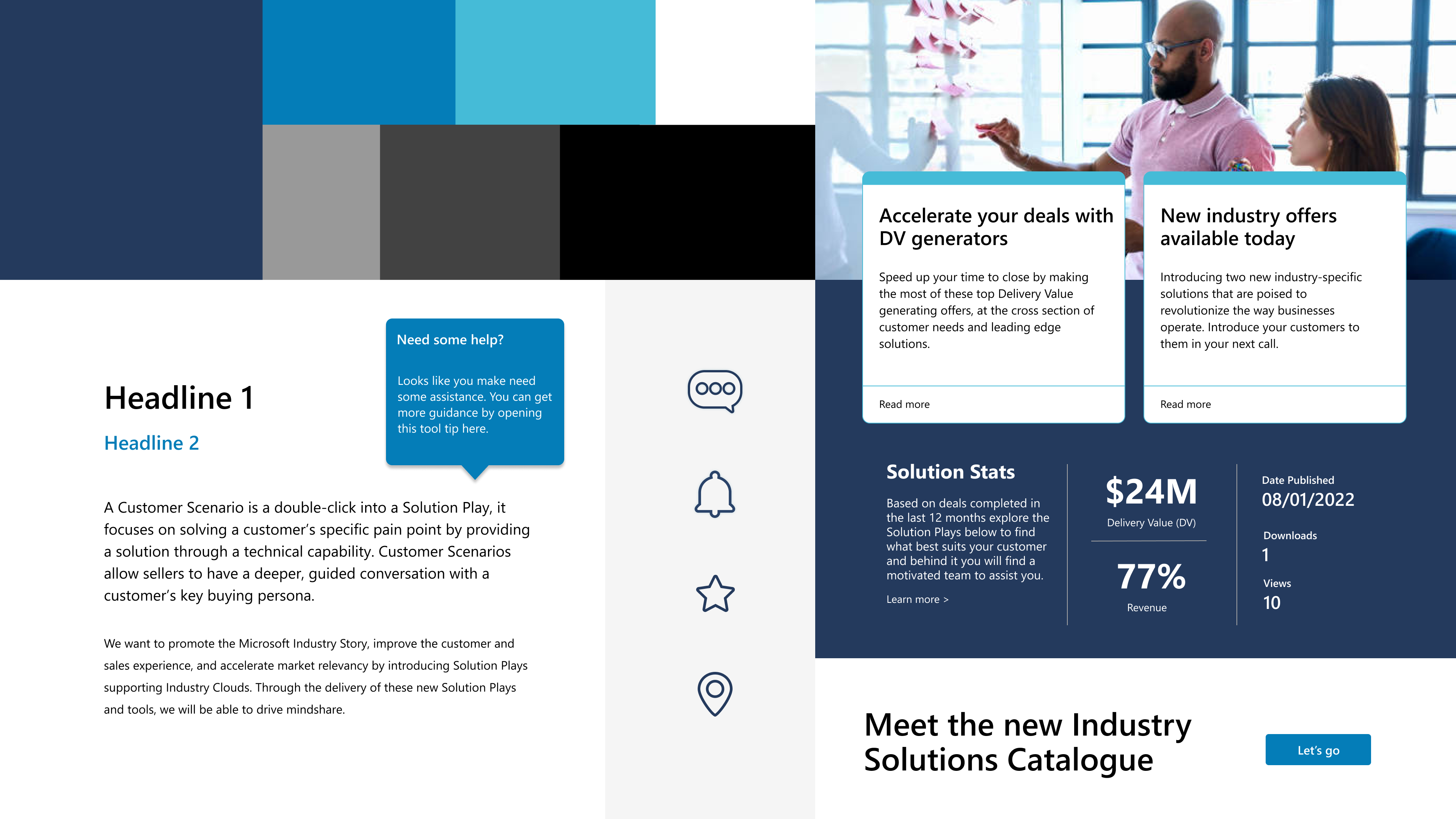
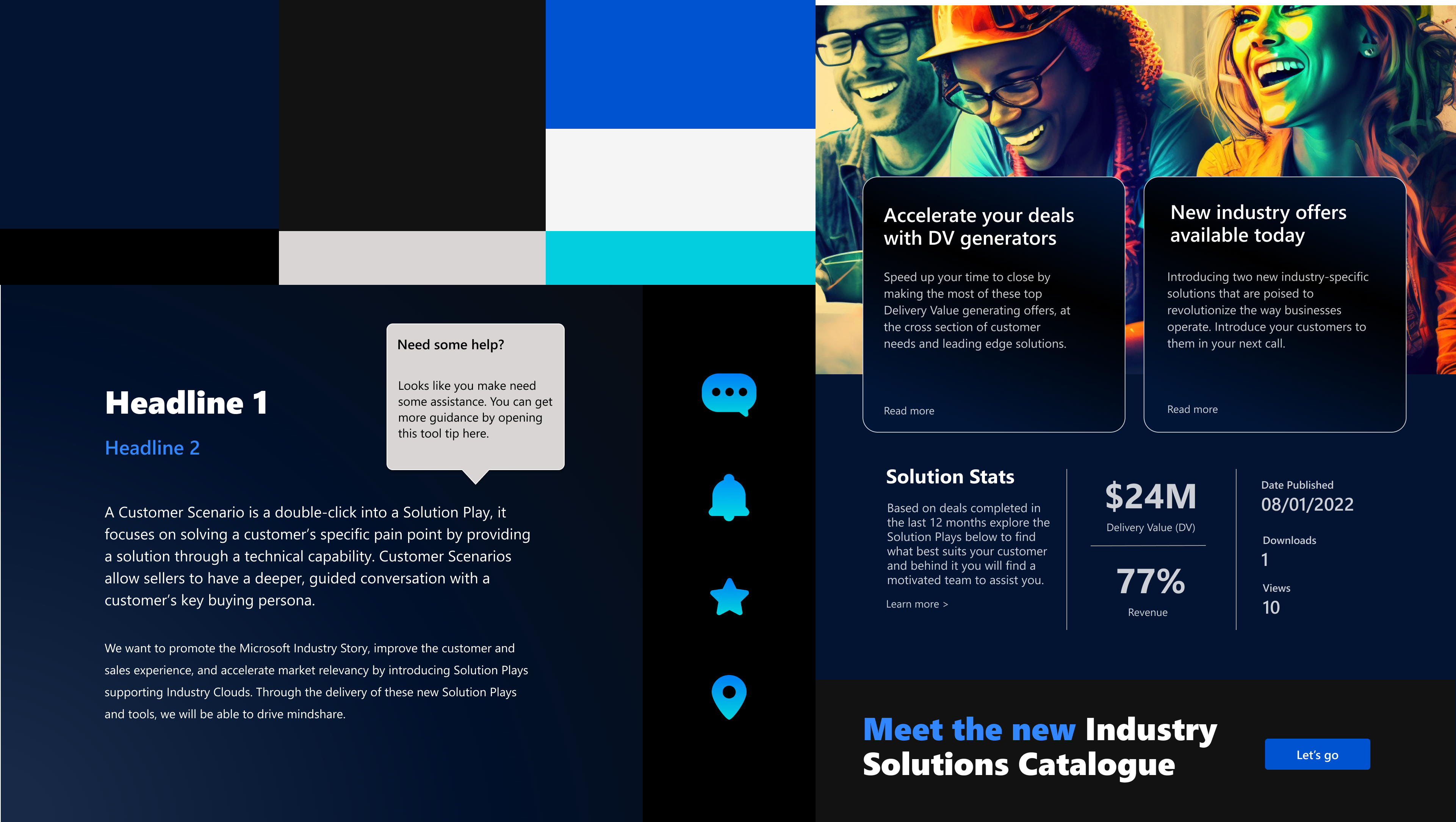
After looking at some market trends and exploring what is out there, we were ready to begin setting the mood.
I typically use a “left, center, right” approach for driving stakeholders to decision making. Left is the most basic, easy to implement. Right is a more ambitious approach. Finally, center is a mix and merge of left and right.
I took this approach for my own decision making in regards to a competitive analysis, mood boarding, and overall creative direction.
Left
✅ Center
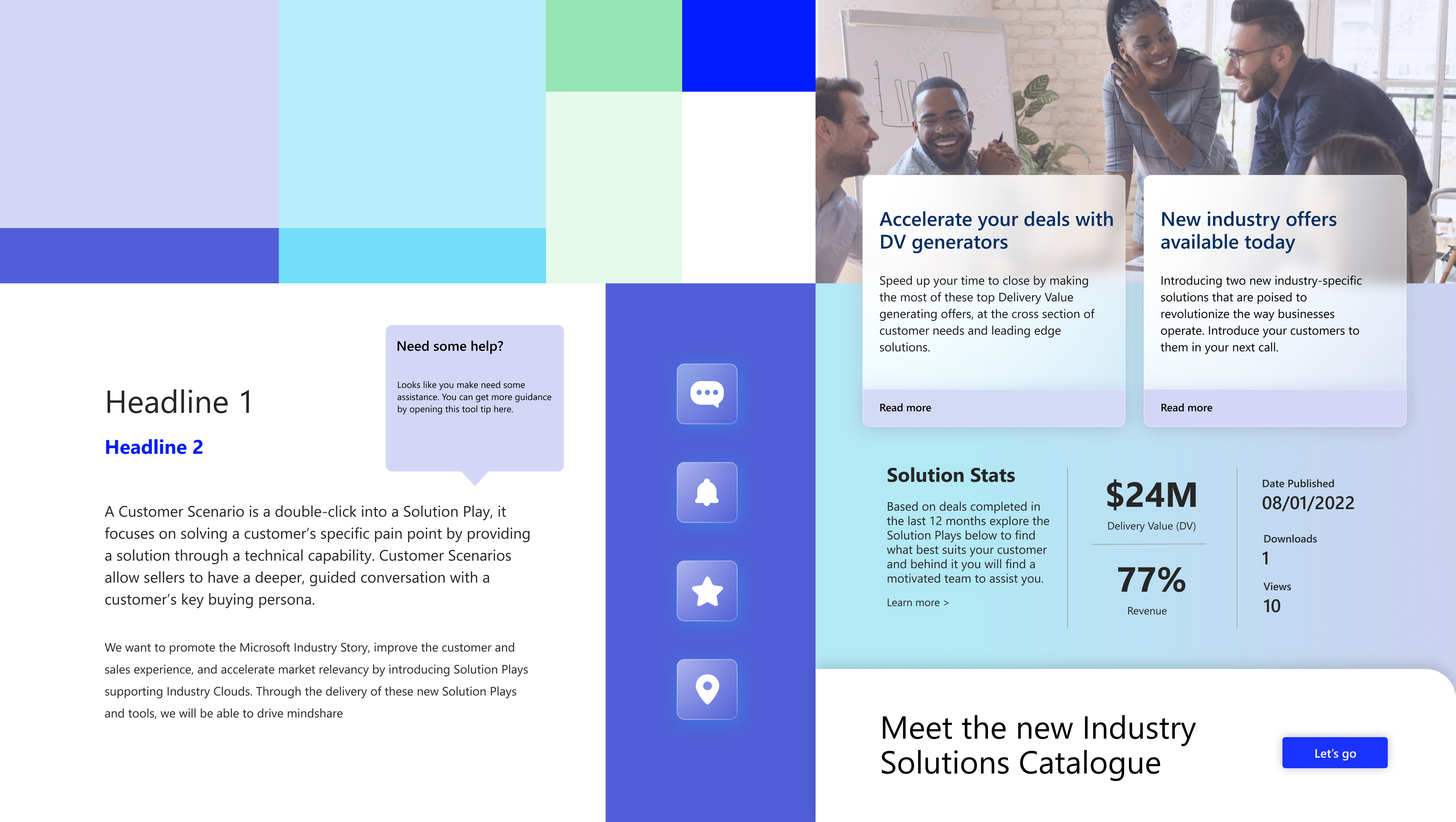
Immersive
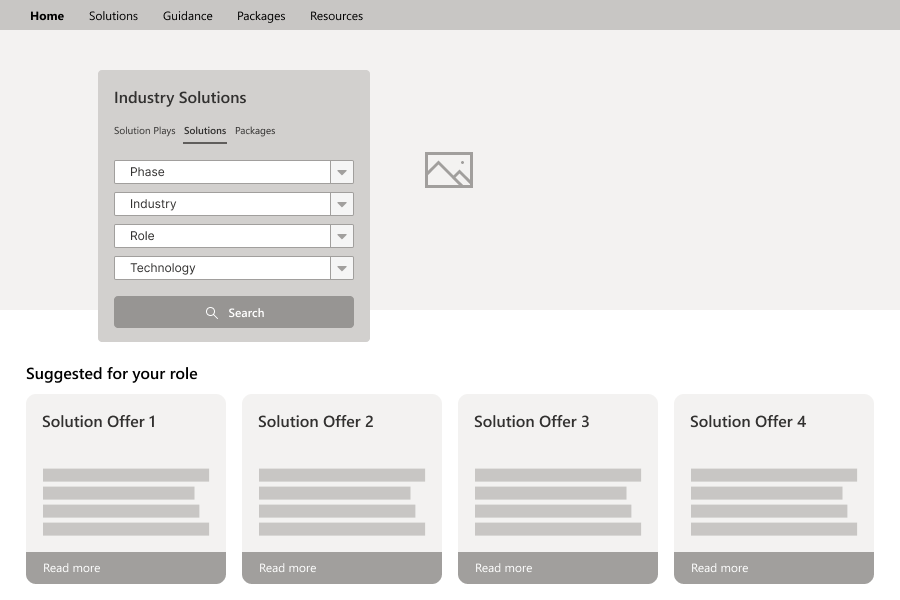
Wireframes
We presented low fidelity concepts to stakeholders to facilitate decision-making and to maintain focus on the UX.
Focus areas
✔️ Personalized landing experience (by persona)
✔️ Optimized Search experience
✔️ Information Architecture revamp
Designing for personalization
Through thoughtful consideration of user data and behavior, we curated various experiences based on their role, that guides users seamlessly through their journey while delivering content and features that are not just relevant but also anticipated.
Low ➡️ High fidelity
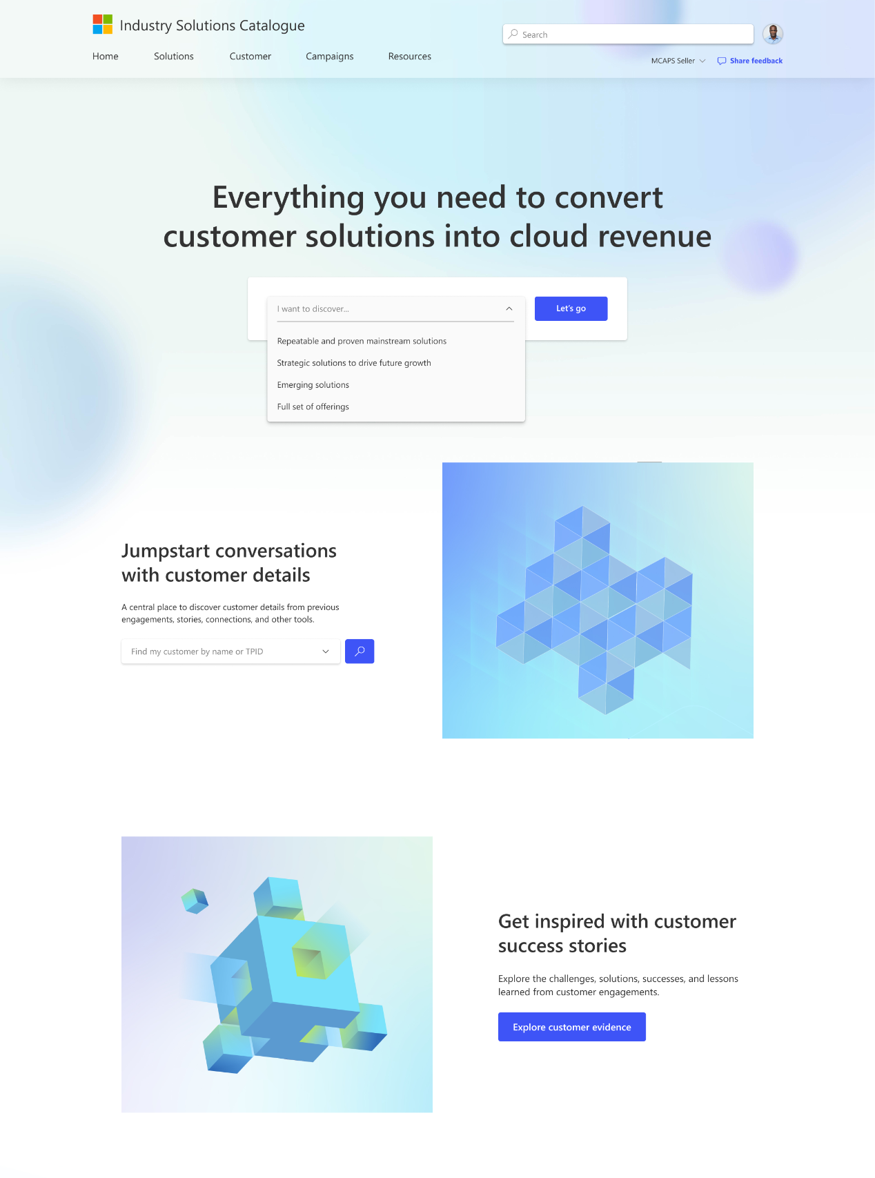
Mainstream seller experience
A mainstream seller persona will see this landing page. This is based on the user’s role in the organization.
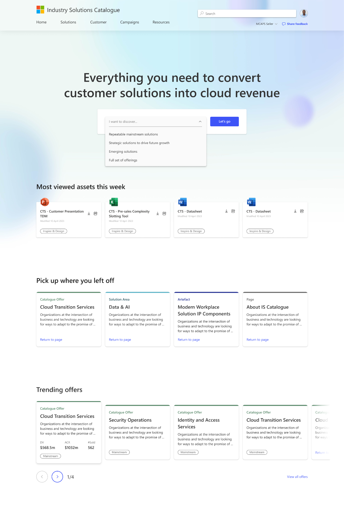
A technical seller experience
This view is based on the user’s role in the organization. They see trending assets and if applicable, pick up where they left off.
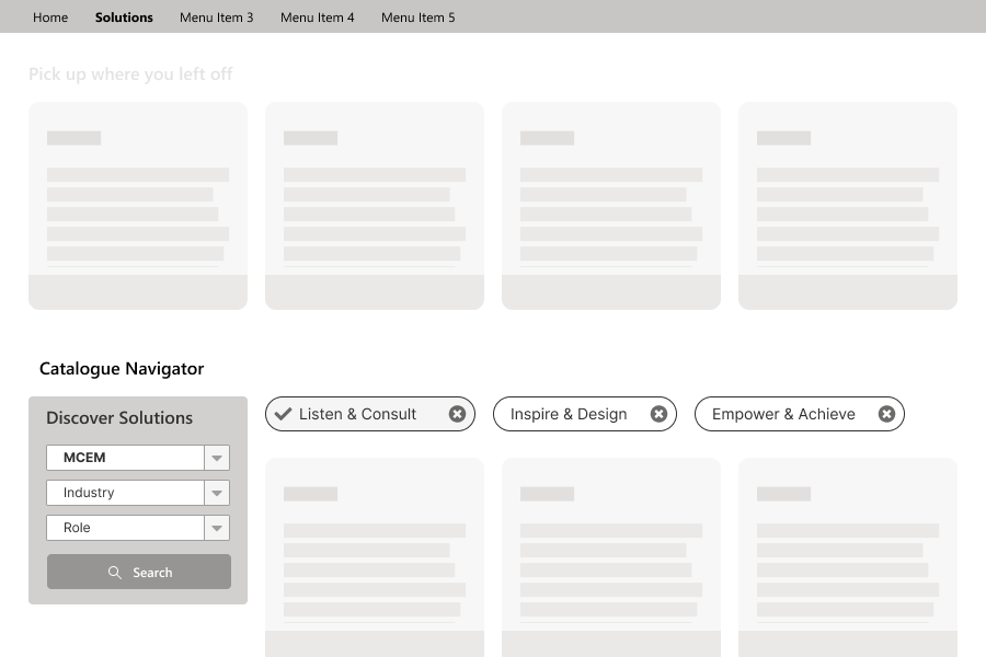
Search and filtering
Streamline the user journey by narrowing down content based on their preferences or requirements. Also enhancing the overall experience by reducing clutter and cognitive overload. Ensure users only encounter content and features that are pertinent to their end goal.
Low ➡️ High fidelity
As soon as the stakeholders understand and there is buy-in on the design direction, we start to increase the level of fidelity, and ended up here.
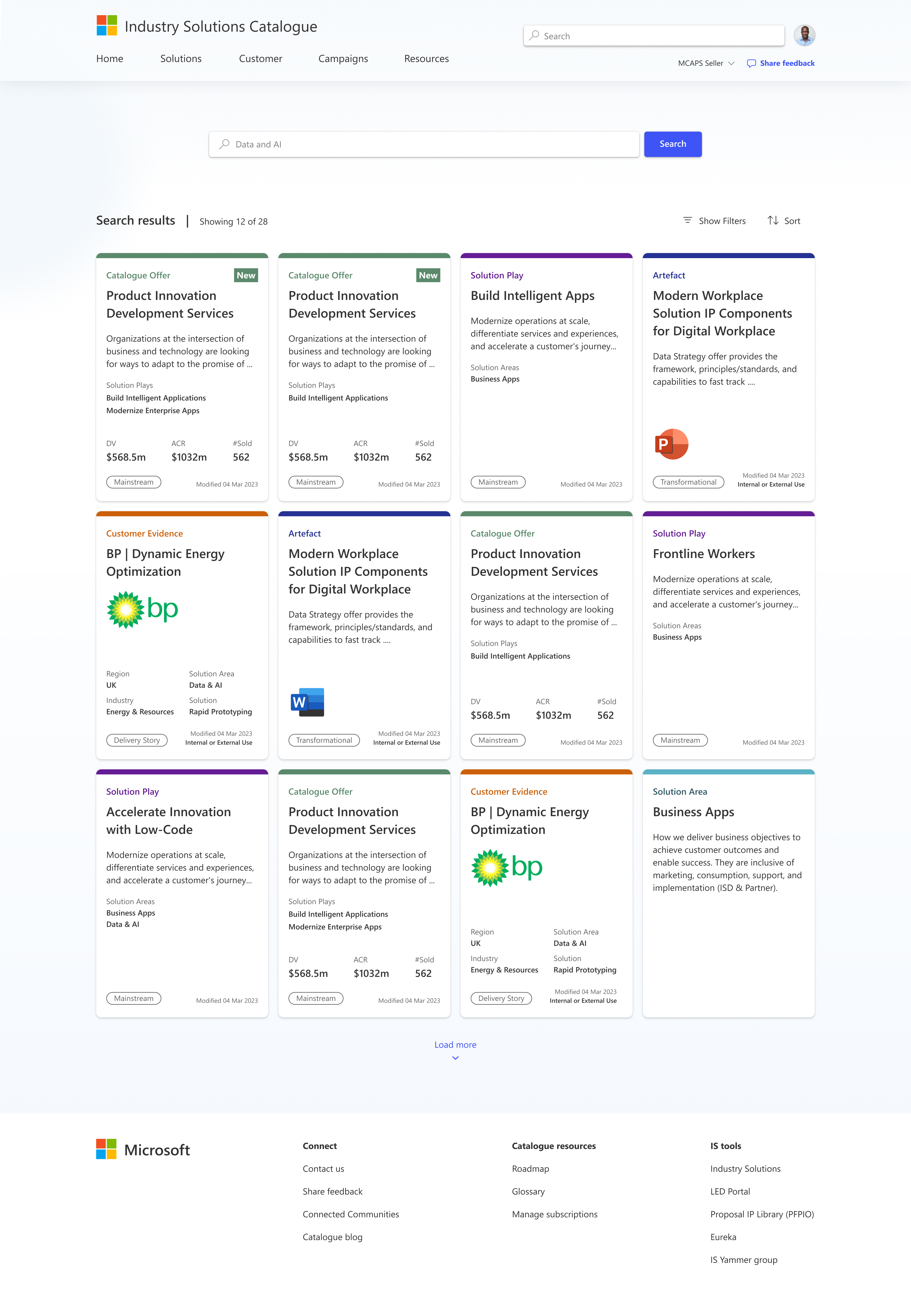
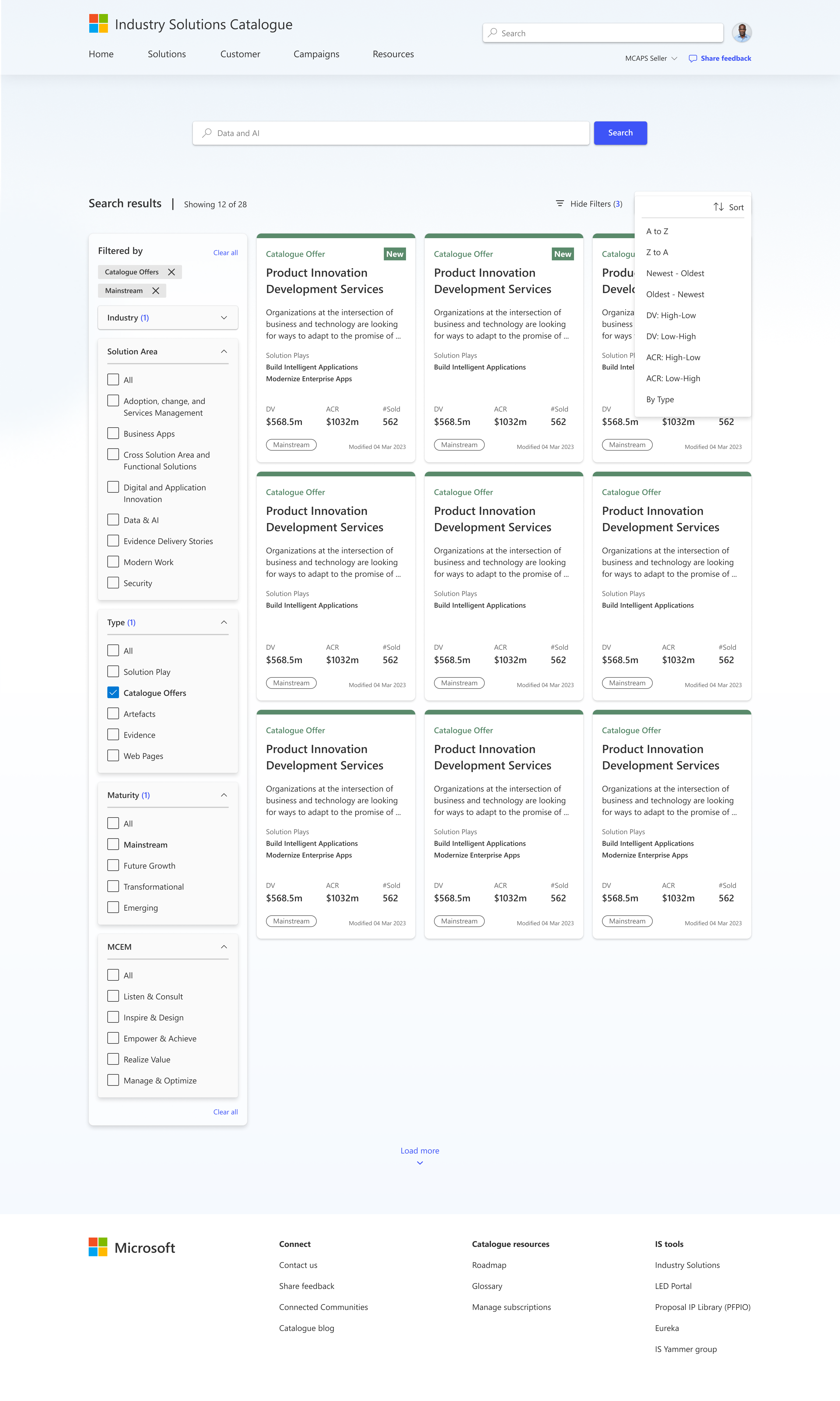
Search experience
Includes color coding of based on the type of asset.
Filtered search experience
Includes a left filtering experience filtered by “Catalog offers”, which are labeled green.
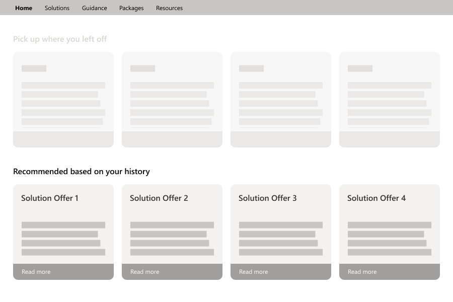
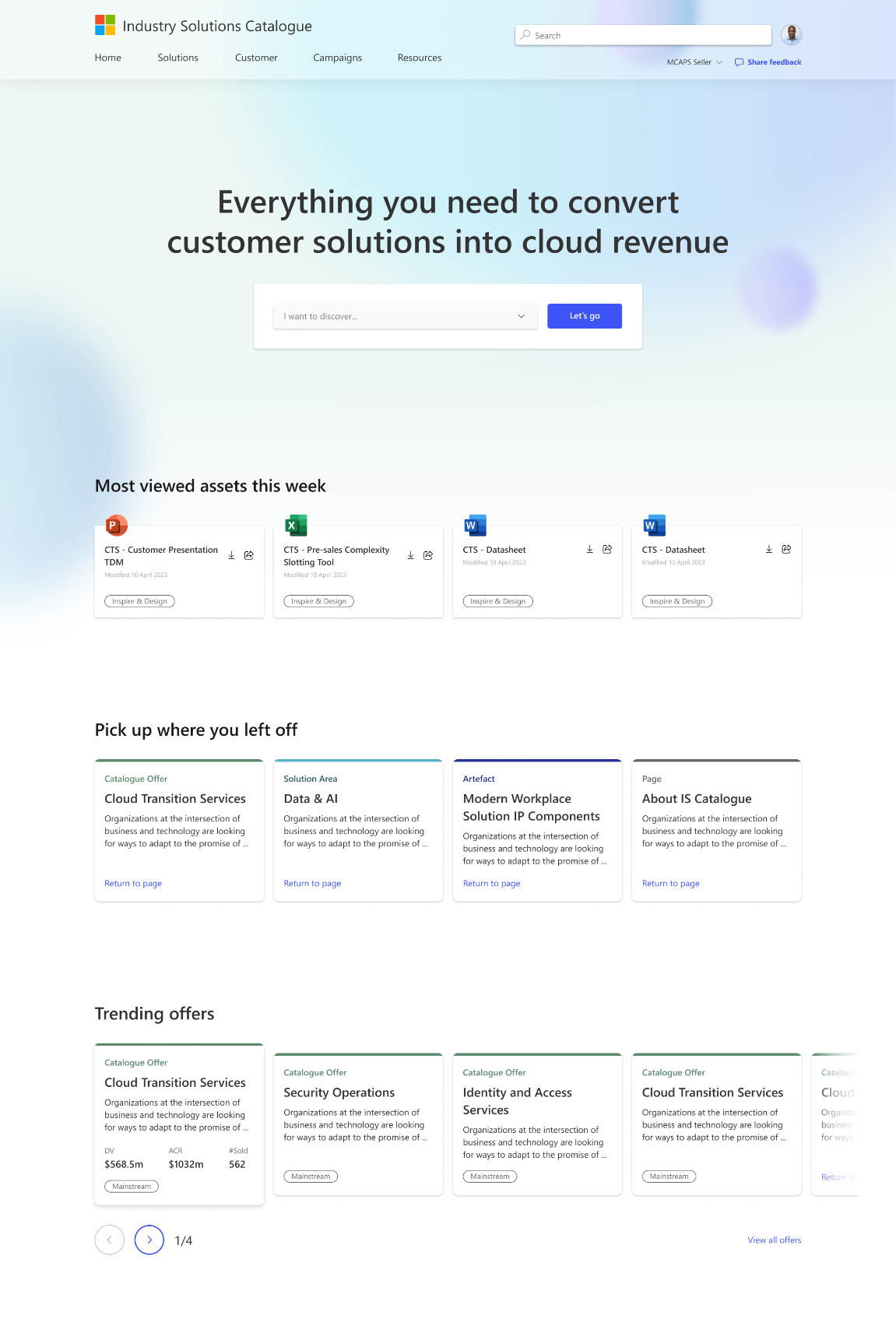
Surface smart recommendations on Landing page
Similar to filtering, recommendations also streamlines the user journey by proactively surfacing relevant content to the user. Recommendations leverage algorithms to suggest content based on user behavior, preferences, and patterns.
Low ➡️ High fidelity
As soon as the stakeholders understand and there is buy-in on the design direction, we start to increase the level of fidelity, and ended up here.
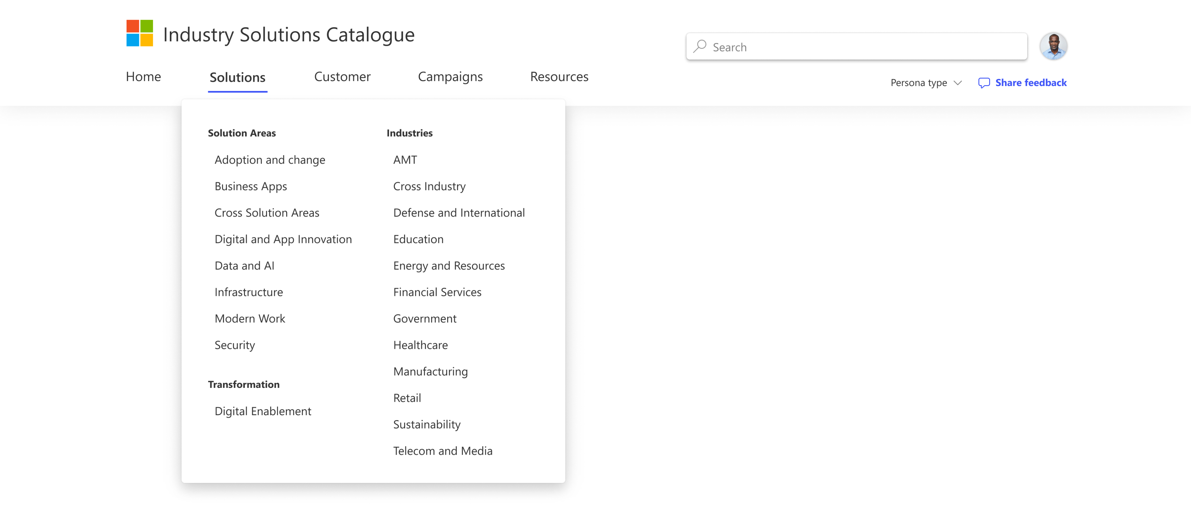
Navigation revamp
I did a bit of navigation exploration early on. It can significantly enhance a user journey by providing intuitive and efficient access to content and features. An enhanced navigation is crucial to organize content into logical categories or sections, and providing streamlined access, clear organization, visual hierarchy, deep linking, and responsive design.
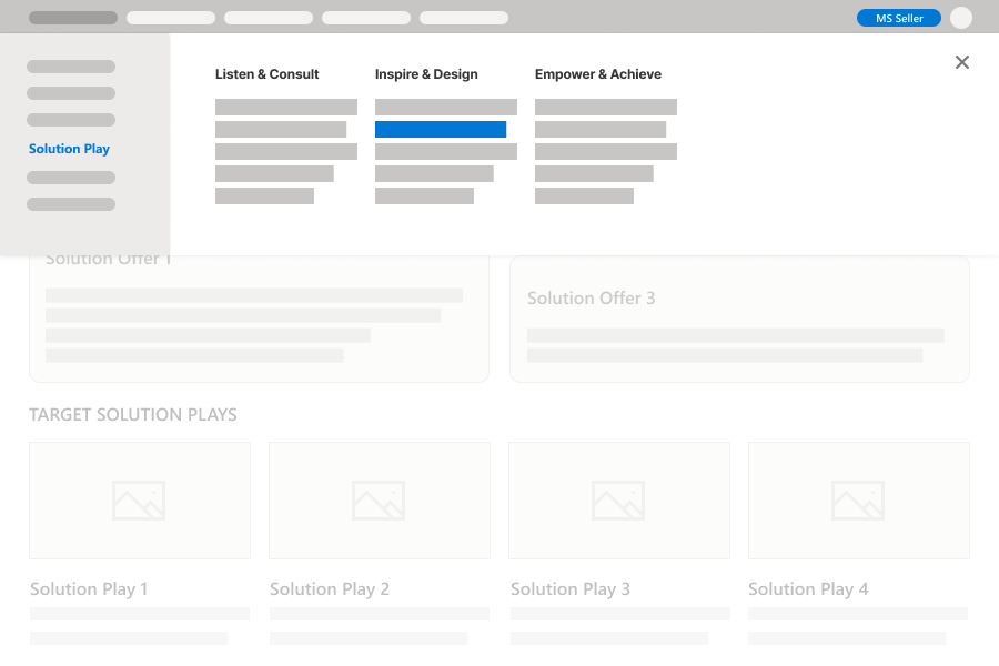
Low ➡️ High fidelity
As soon as the stakeholders understand and there is buy-in on the design direction, we start to increase the level of fidelity, and ended up here.
Outcome
Ultimately, iterative design helped us push the needle. Establishing the design system as we moved high fidelity accelerated our iterations rapidly. Also leveraging the existing design system at Microsoft was important and helped quickly.
It would’ve been valuable to use a low fidelity wireframing kit, as well as a a mid fidelity state to ensure that stakeholders are less focused on giving content feedback, and more focused on giving design relevant feedback. You can find additional context on post launch and screenshots in Notion.